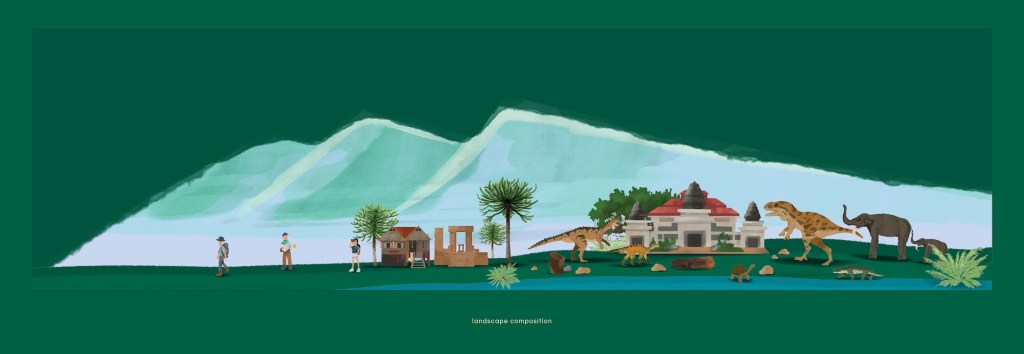
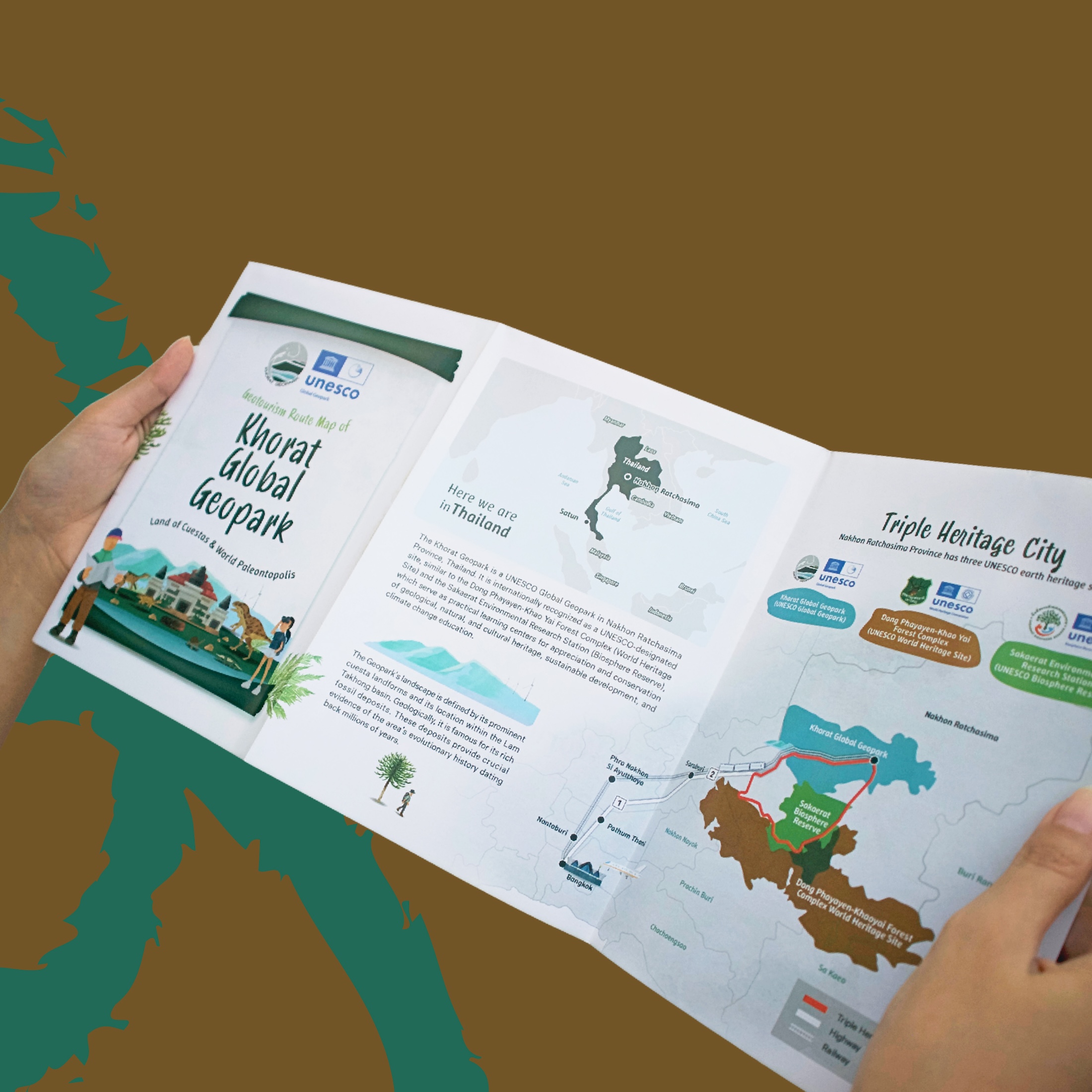
To truly capture an organic feel and honor the client’s “Life on the Canvas” concept, we decided to present all the illustrations in a watercolor style.
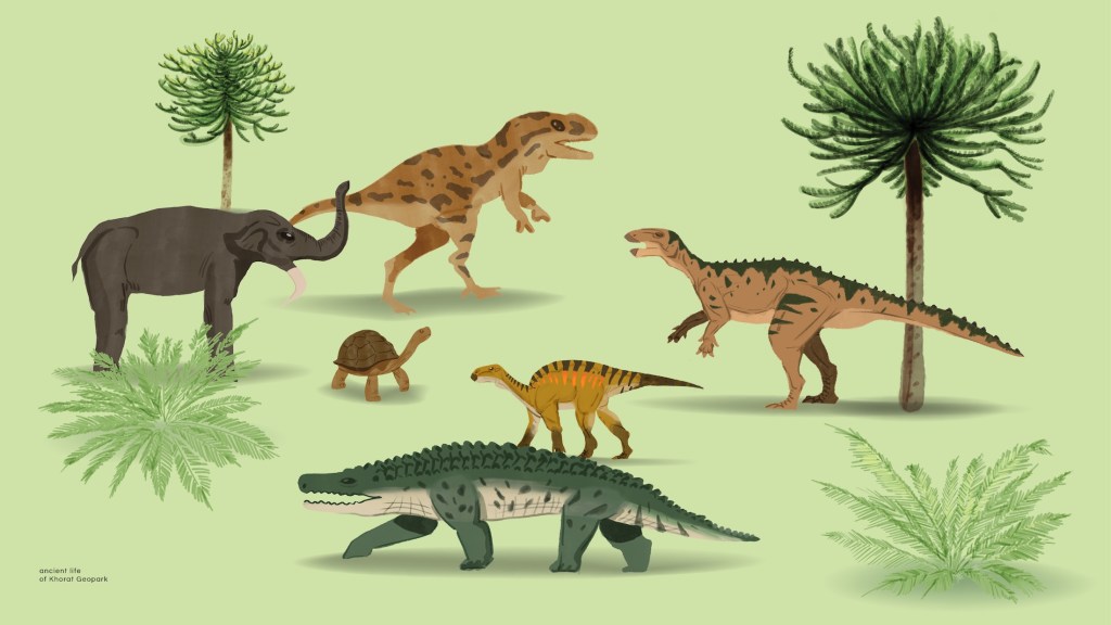
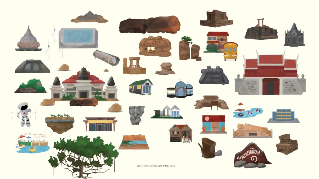
concept: Life on the Canvas
- the goal was to create illustrations with a natural, organic feel.
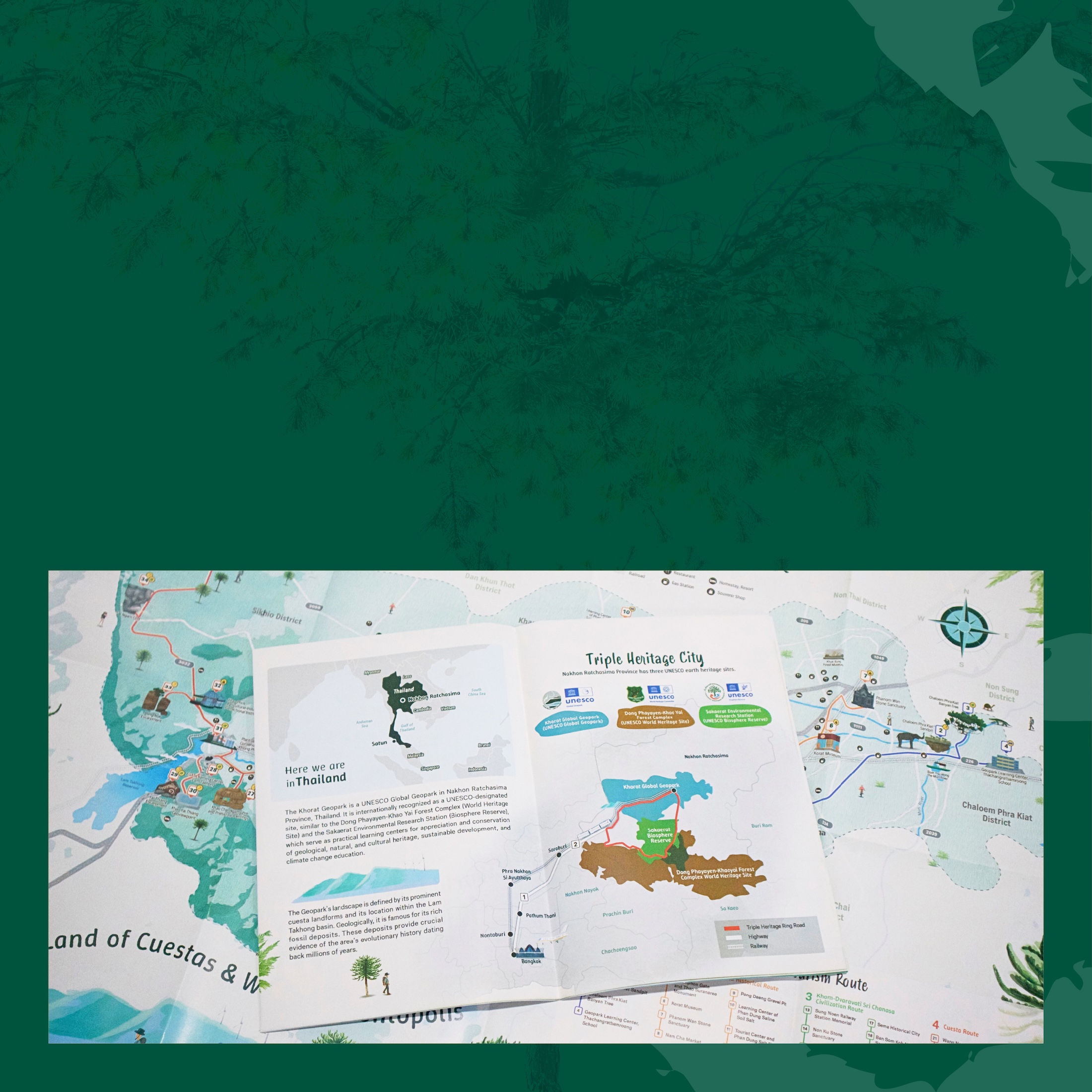
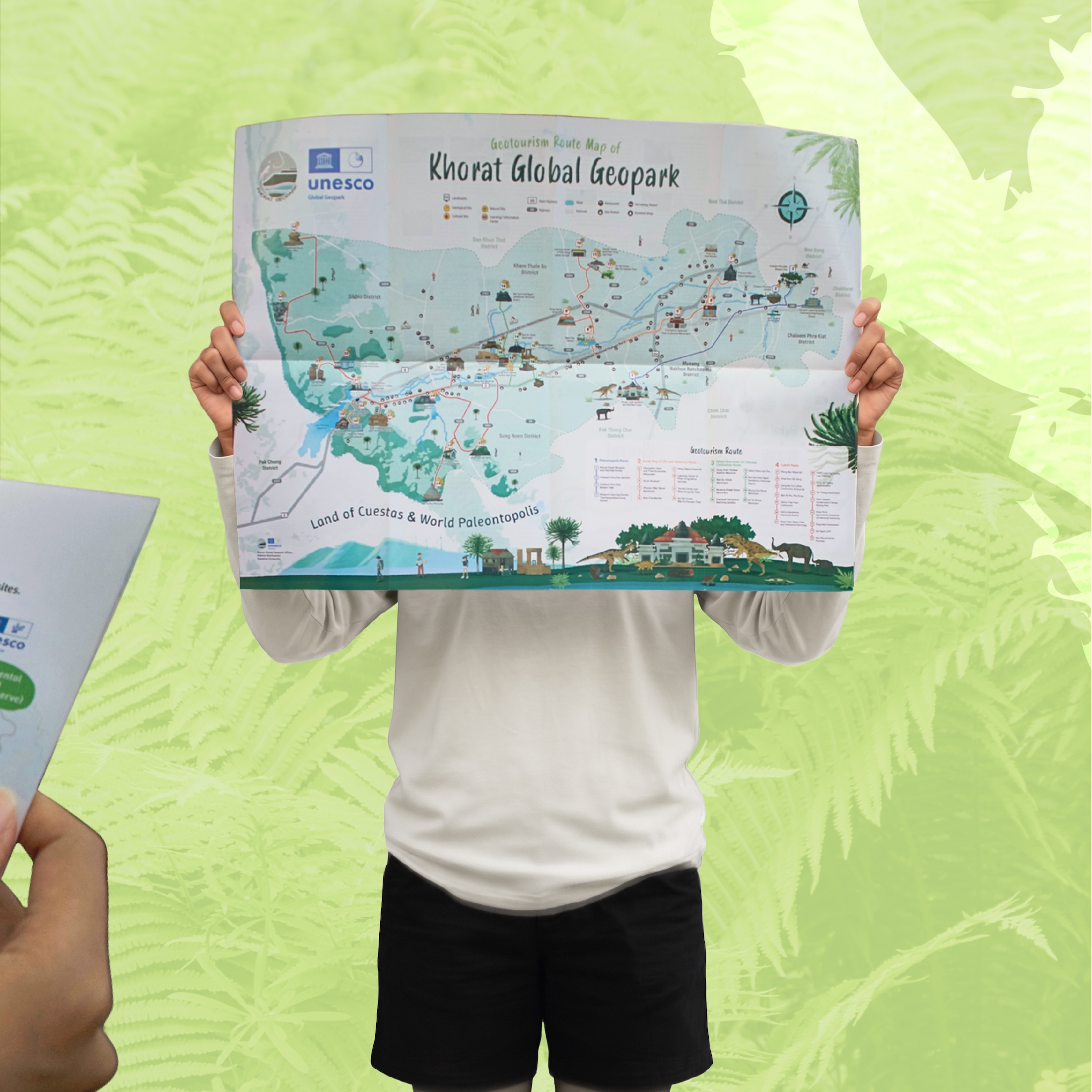
- showcasing all the landmarks of Khorat Global Geopark.
- categorized by the type of attractions.
- setting the overall mood using watercolor brushes.
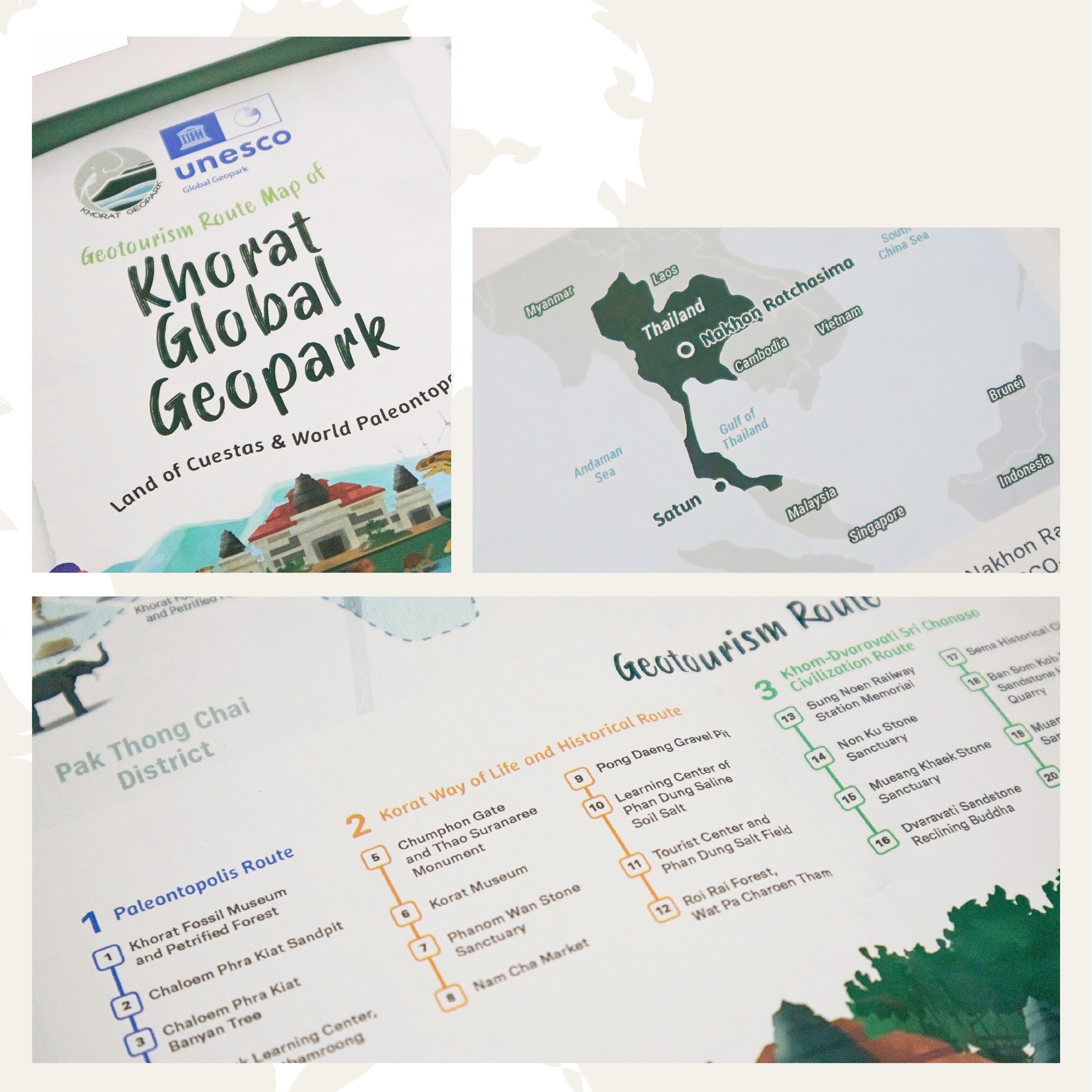
beyond aesthetics, we were highly intentional about creating a clear communication system for the map that accurately reflects the brand’s identity through specific icons and color palettes
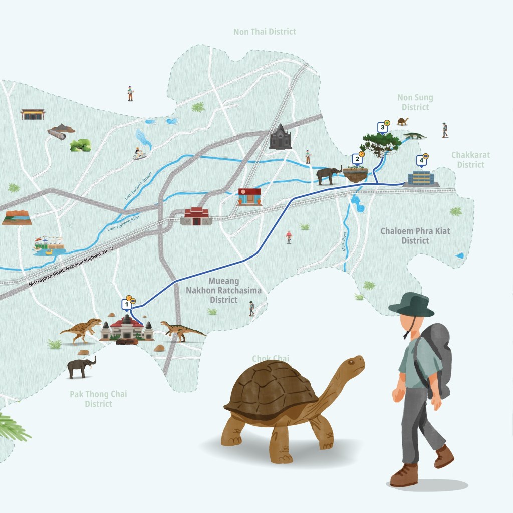
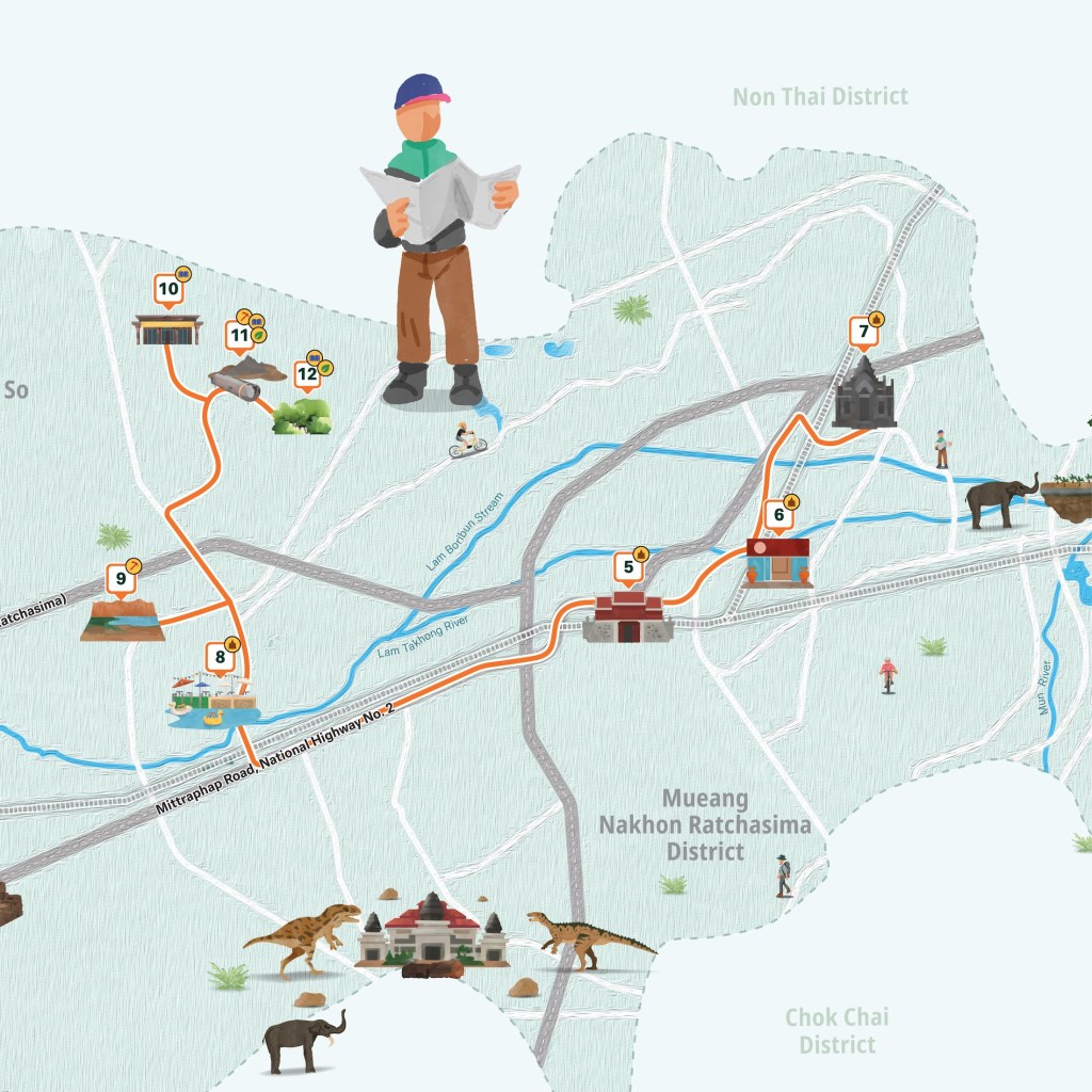
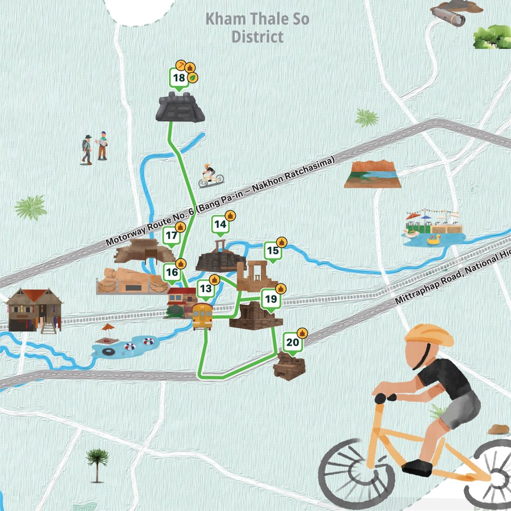
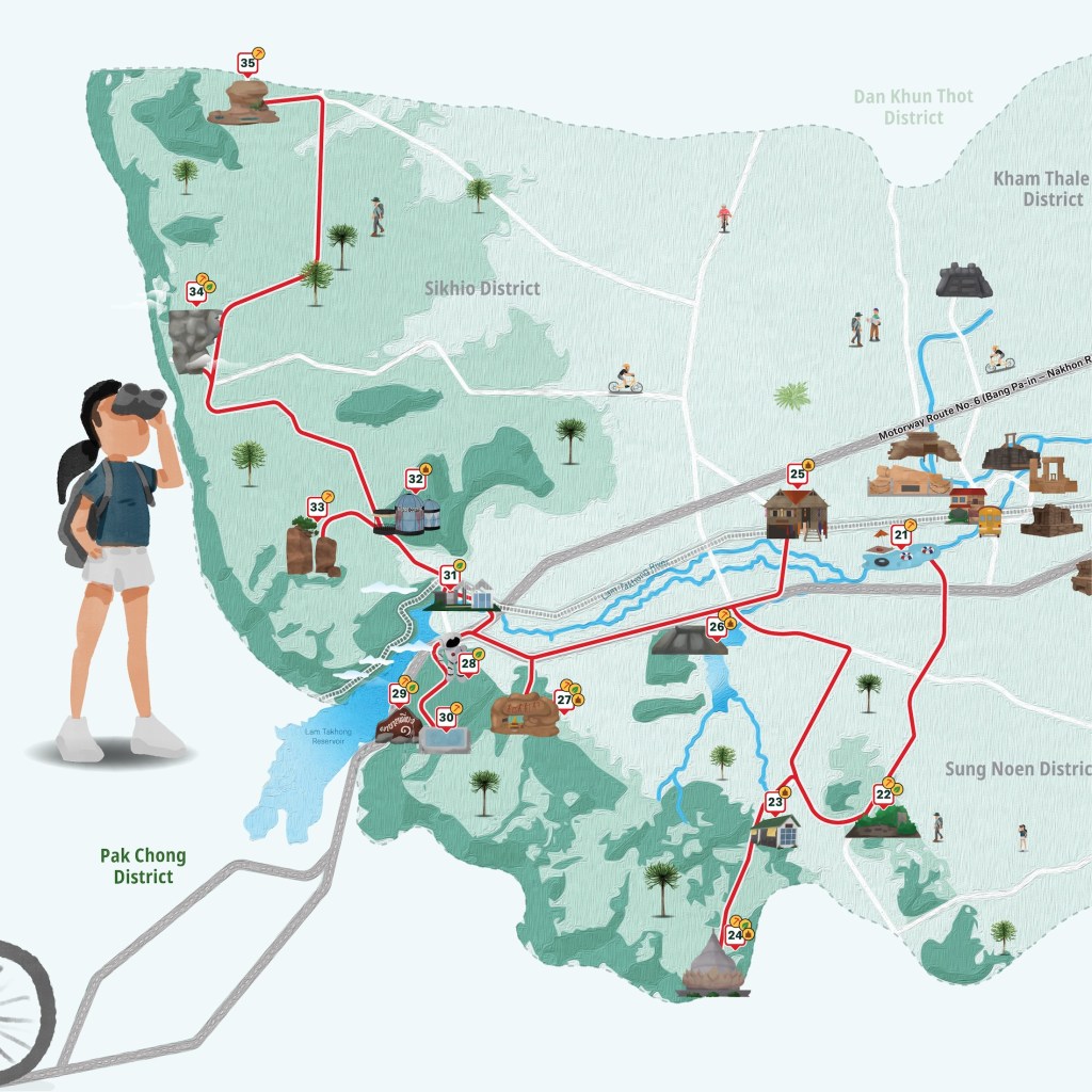
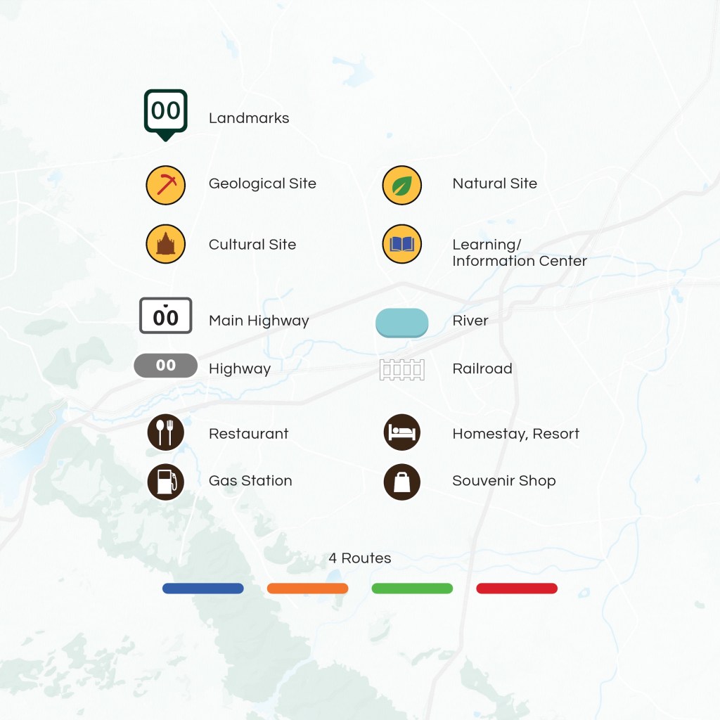
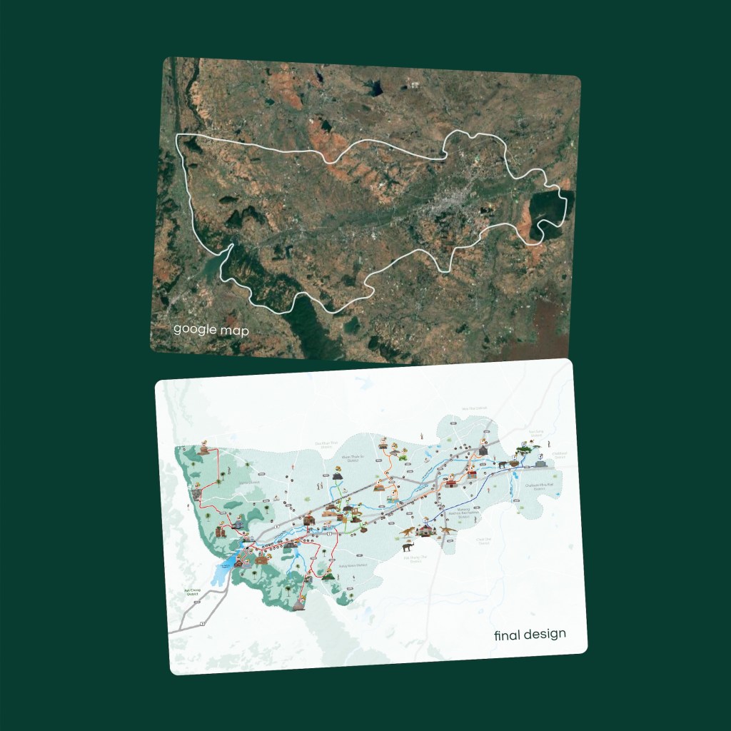
- terrain colors: we matched the ground colors with the Khorat Geopark logo. you will notice a transition from light green to darker shades, which visually represents the elevation from low to high areas.
- travel routes: we used distinct colors to clearly separate and categorize the different travel paths.
- landmark icons: specific icons were designed for each landmark to easily indicate whether it’s a geological site, a cultural site, a natural site, or a learning center.
- essential map elements: we also included essential map elements like main highways, secondary roads, rivers, and railways.
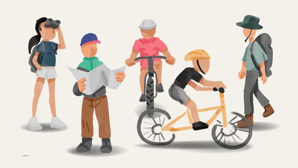
the reason we focused so heavily on providing complete and accurate routes is because this map is thoughtfully designed for our main audience: out-of-town visitors and international tourists who are coming specifically for geological tourism.
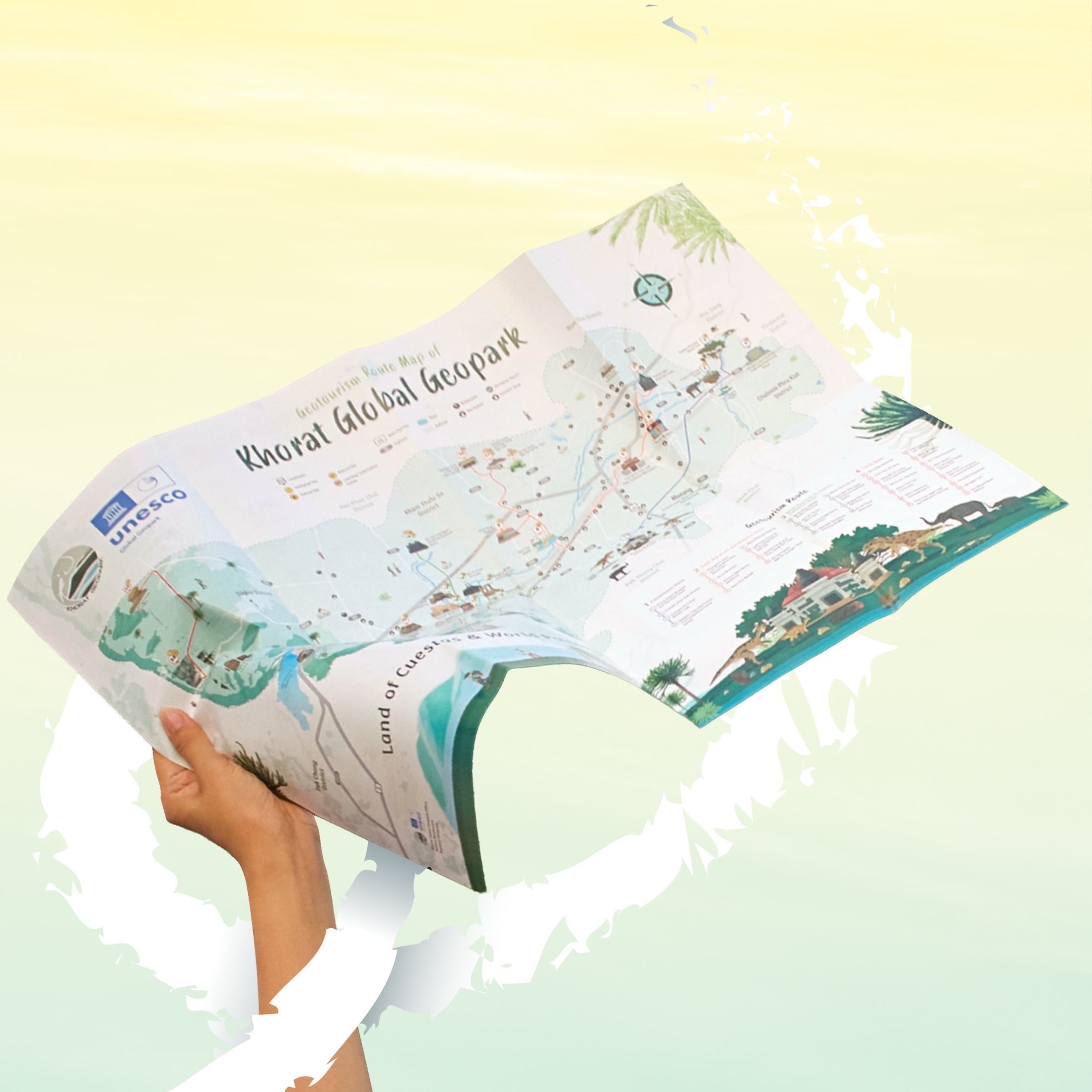
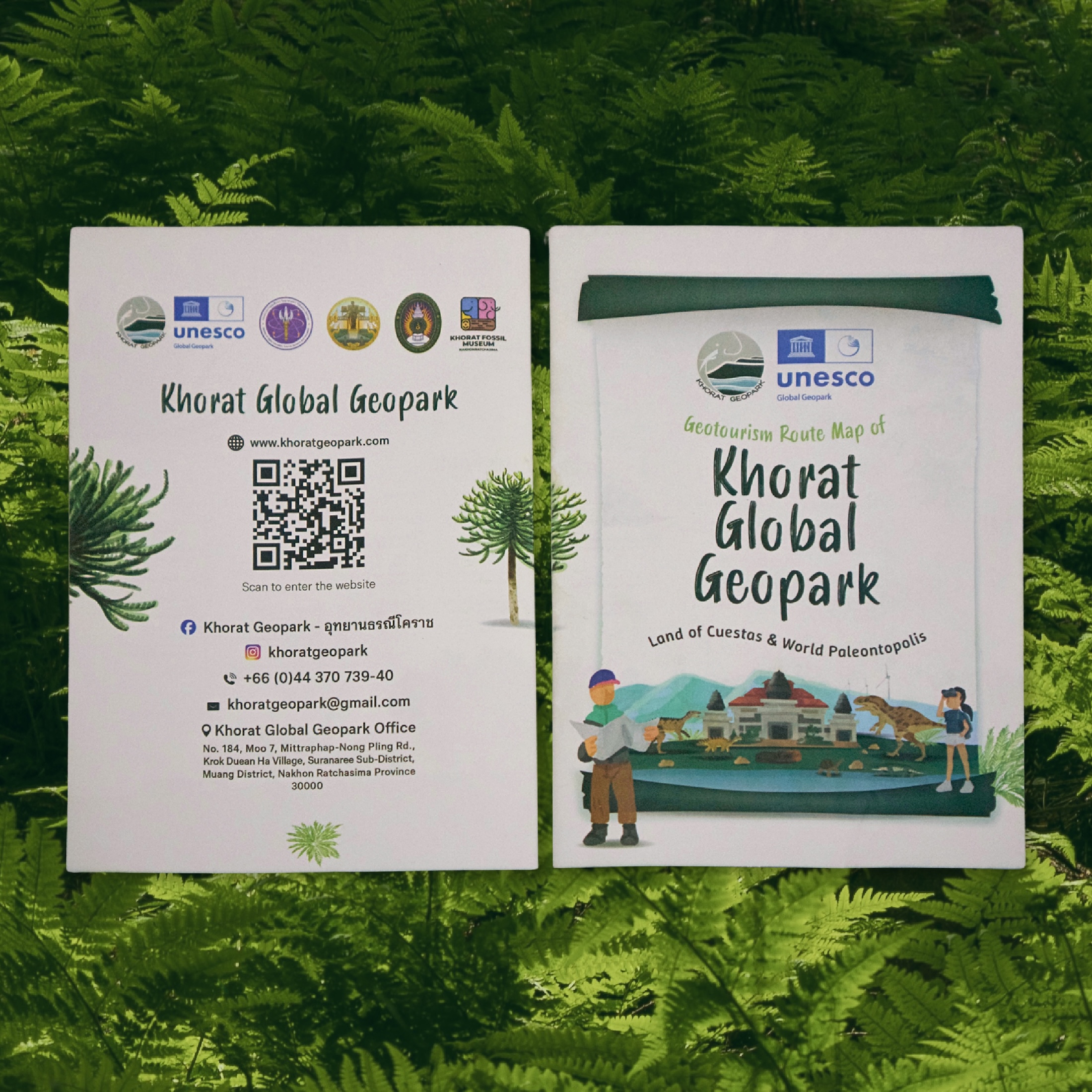
this project really pushed us out of our comfort zone! we usually specialize in vector art, so we had to dust off our watercolor skills that we haven’t used in a really long time. 😀
Thank you for reading all the way through! 🙏
If you enjoyed our work, don’t forget to show some love 💙
→ Like our page on Facebook
→ Follow us on Instagram and TikTokLet’s keep creating something meaningful — together ✨
client | Khorat Geopark
co-project | Building Block Co.,Ltd.
© 2026 indeedly studio | details matter to us.
 indeedly studio