“When running becomes inspiration, design becomes the journey we want people to remember.”
SUT Marathon is a mini-marathon organized by Suranaree University of Technology (SUT) with the goal of encouraging everyone to get moving and experience the refreshing natural route throughout the campus.
This year is extra special for our team at indeedly, as we had the opportunity to design the event’s Visual Identity. We poured our hearts into creating a look that radiates positive energy, vibrancy, and movement — through colors, logo, mascot, and illustrations — so that runners could “feel energized” even before they start running.
Because we believe that design can be a visible form of positive energy, here’s how we brought the vision to life:
1. It all starts with asking the question:
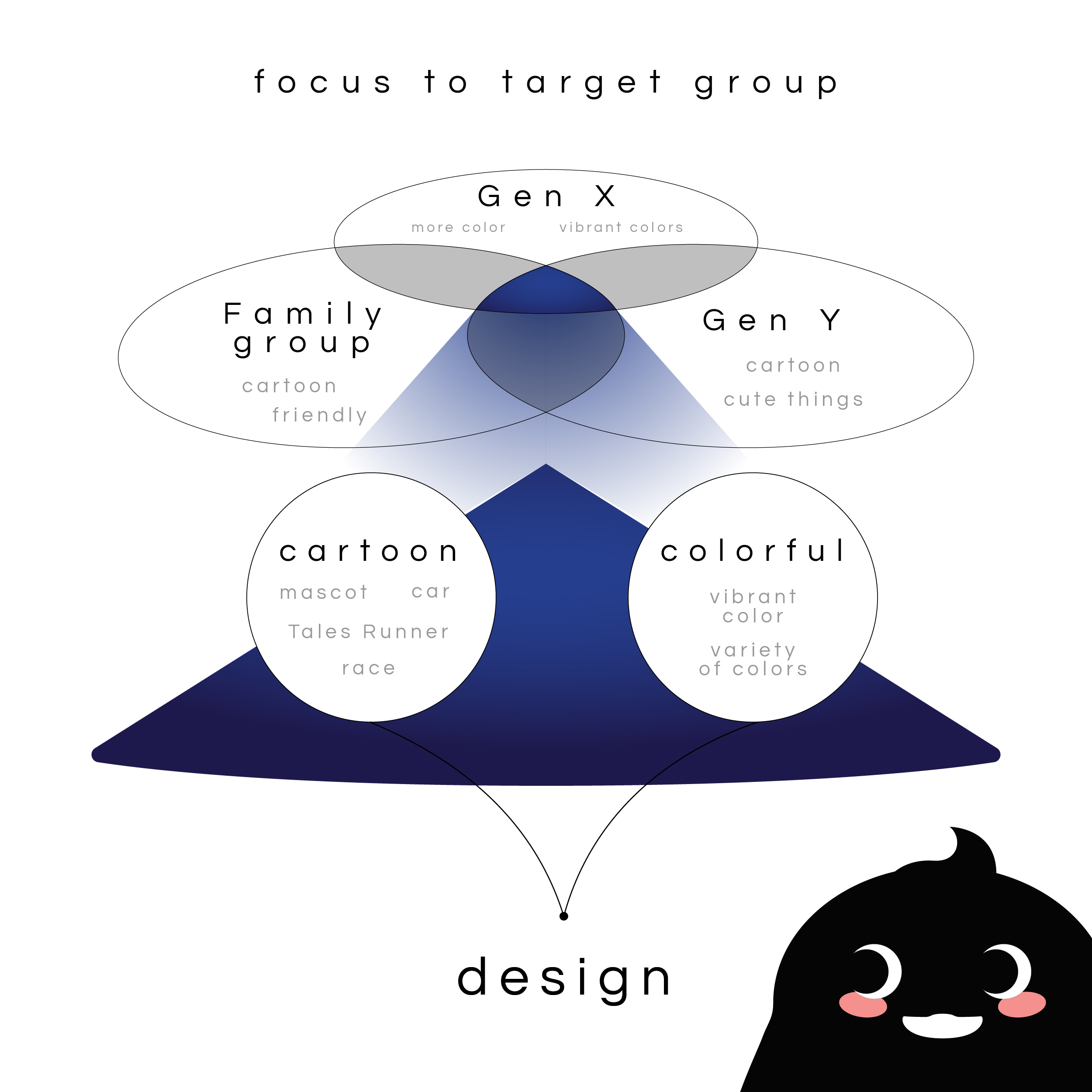
Who are we talking to, and how do we reflect the identity of SUT through design?
📍 Together with the client, we defined three core target groups:
- SUT community – including staff, students, and alumni
- Families – especially parents looking to spend a refreshing day outdoors with their kids
- Passionate runners – people who live nearby and follow every marathon event in the area
📍 And here’s what the client’s brief highlighted:
- The visual identity should clearly represent the university
- Use bright, friendly colors and create a welcoming mascot
- A logo that feels energetic and conveys movement
- Explore a design direction that appeals especially to families with kids (Group 2) 😘
2. From brief to concept — shaping the Art Direction
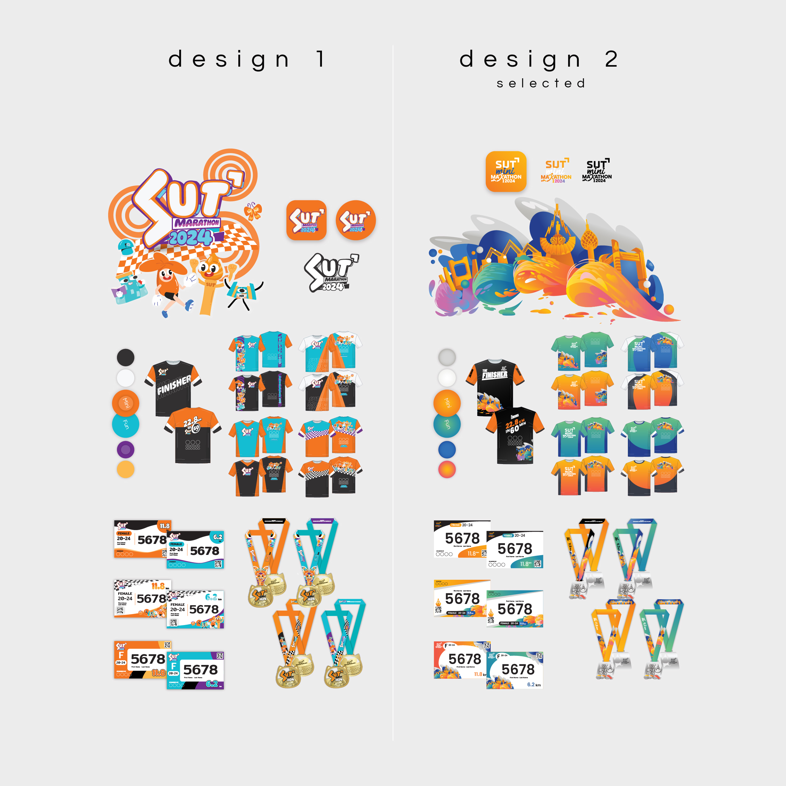
We created two key design routes for the client to choose from, both aiming for a mood & tone that’s: active, friendly, fresh, and full of dynamic vibes.
✦ Design 1: Mascot-led design: Featuring playful characters inspired by SUT landmarks, with bold and vibrant colors
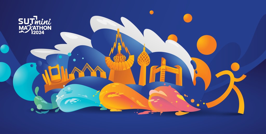
✦ Design 2: Illustration-led identity: A clean wordmark-style logo for legibility and professionalism, paired with dynamic illustrations of key campus landmarks
—
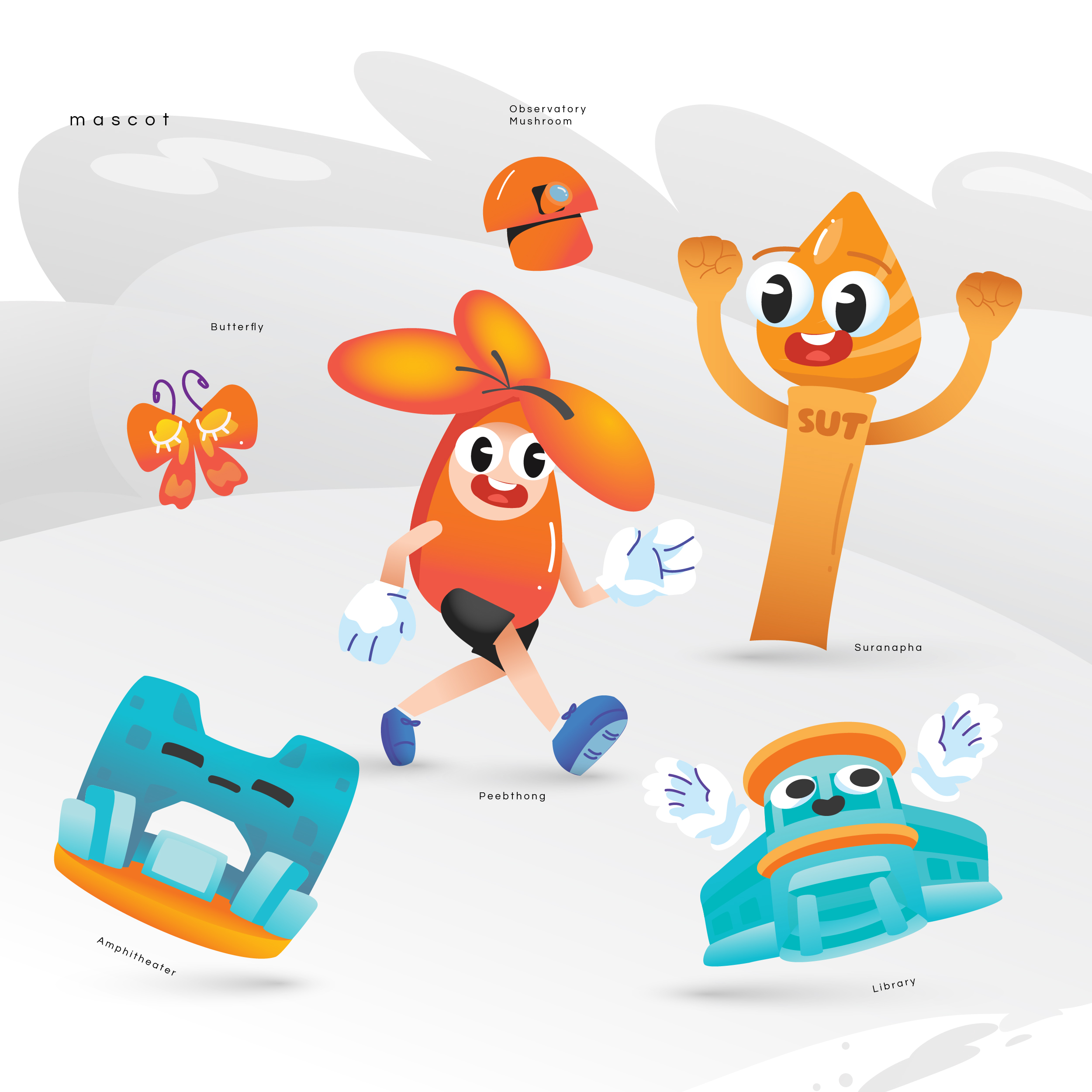
The client voted for Design 2 as Design 1 leaned too childlike for the main tone of the event. But! They loved the mascots so much that they purchased them for use across media banners and other materials 😍
3. Hidden Elements Inside the Visual Identity 🎨
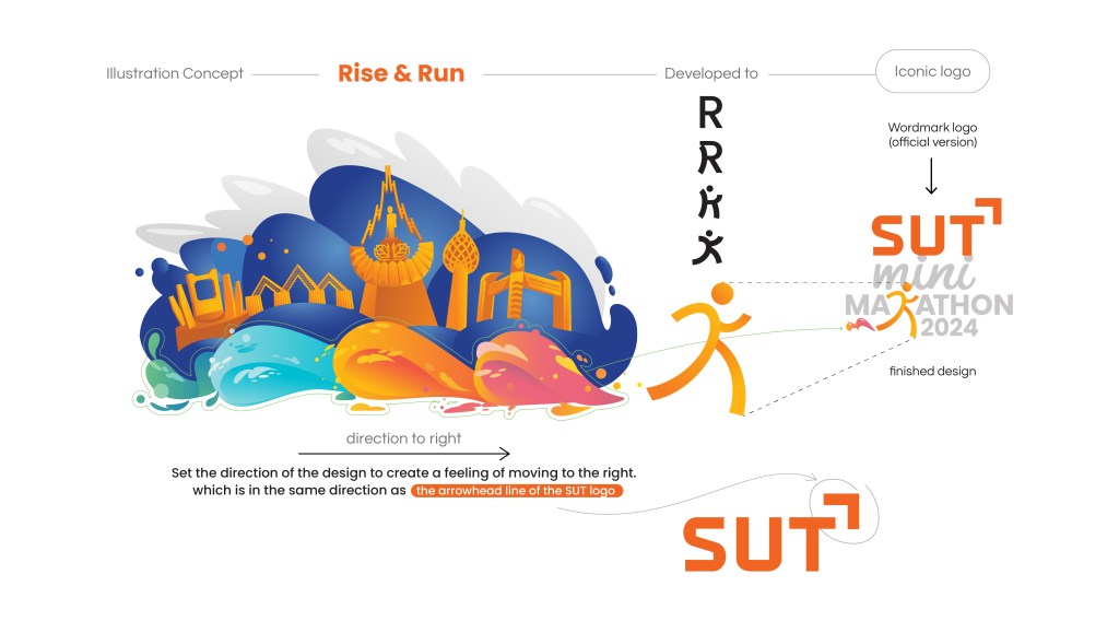
Logo — What inspired it?
- First, we wanted the logo to be easy to read and timeless, so it could be reused each year with only the year updated.
- The word “mini” is in lowercase to highlight the main race category.
- A subtle gimmick in the “R” forms a running person — with a small puff of dust at the foot, symbolizing the runner dashing off from the start line.
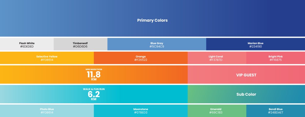
Color Choices
- Primary Colors: SUT’s identity color is orange, so we paired it with deep blue to balance the palette. From a design perspective, orange and blue are complementary, creating a vibrant visual contrast.
- Secondary Colors: Orange and light blue were used to help differentiate race categories.
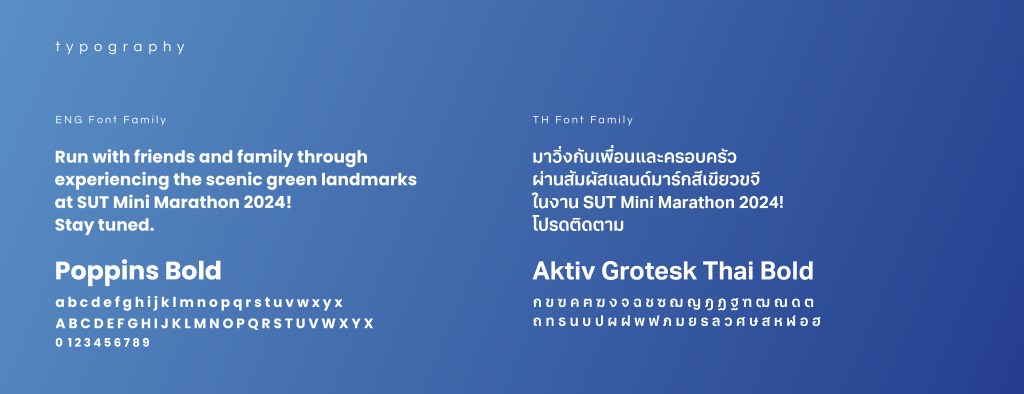
Font Selection
We used a bold and active-style font with strong, compact strokes for readability and to reflect energy and movement.
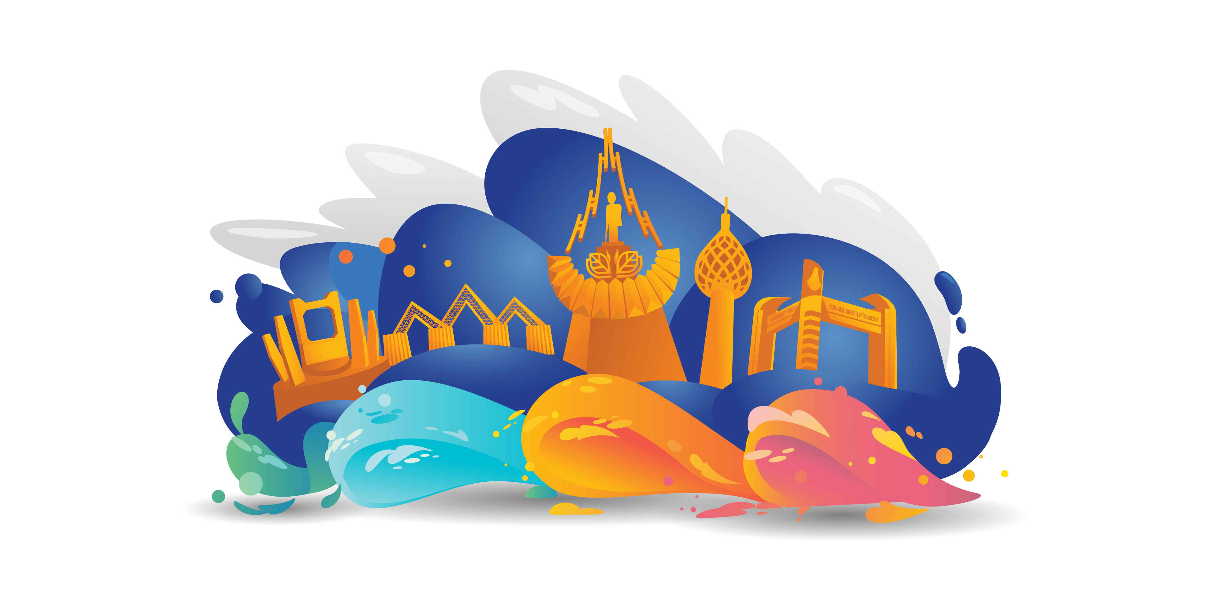
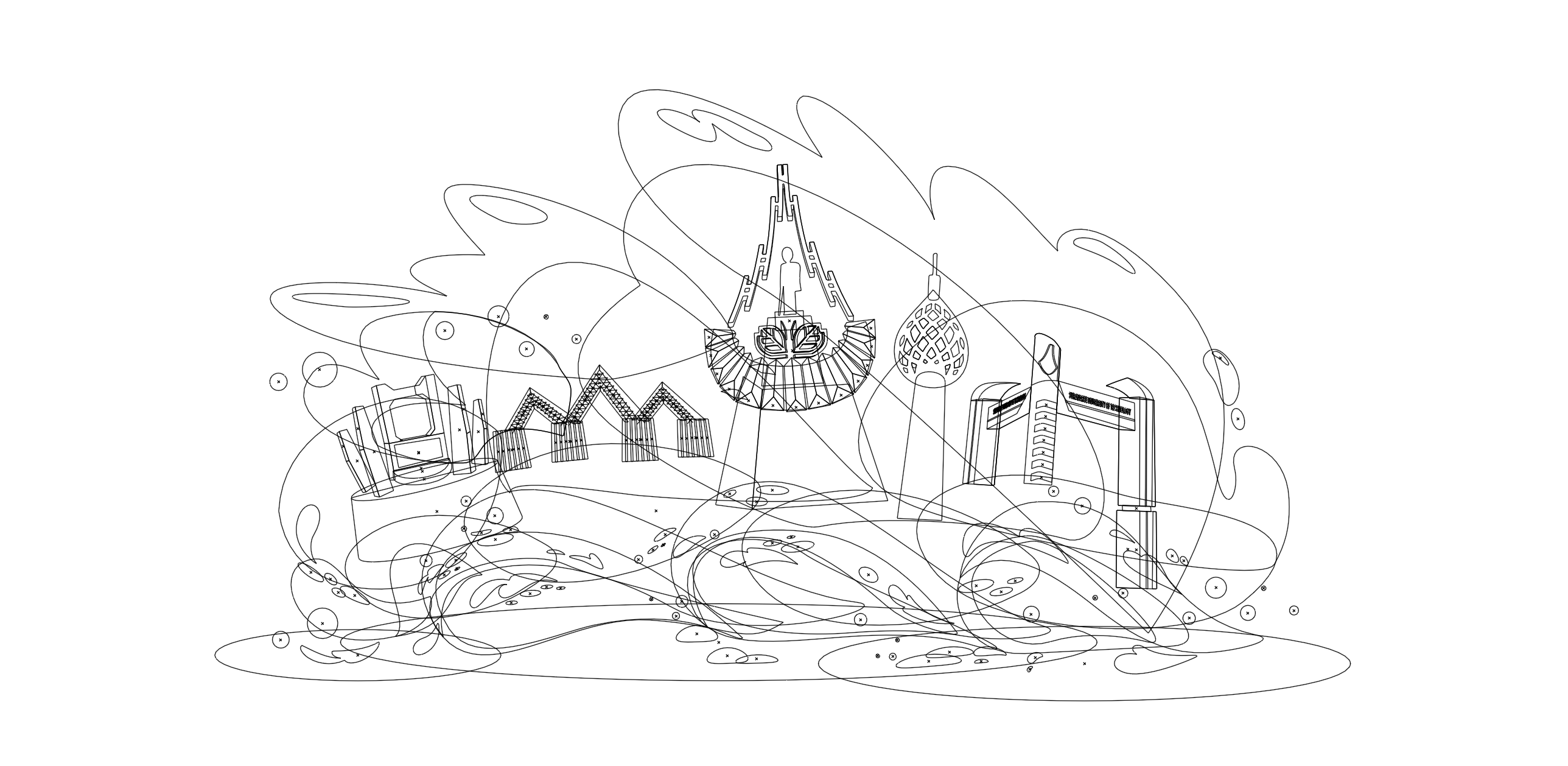
Illustrations
We illustrated key SUT landmarks from an outsider’s fresh perspective — iconic spots that stood out visually:
- The triangular steel-framed structure (we don’t even know the name, but it’s striking!)
- The symbolic building at the heart of campus
- The famous Suranapha Tower
- The main university entrance from the highway
All landmarks were brought together on floating blue clouds, with dynamic motion added through angled dust trails behind — making the composition feel alive and in motion.
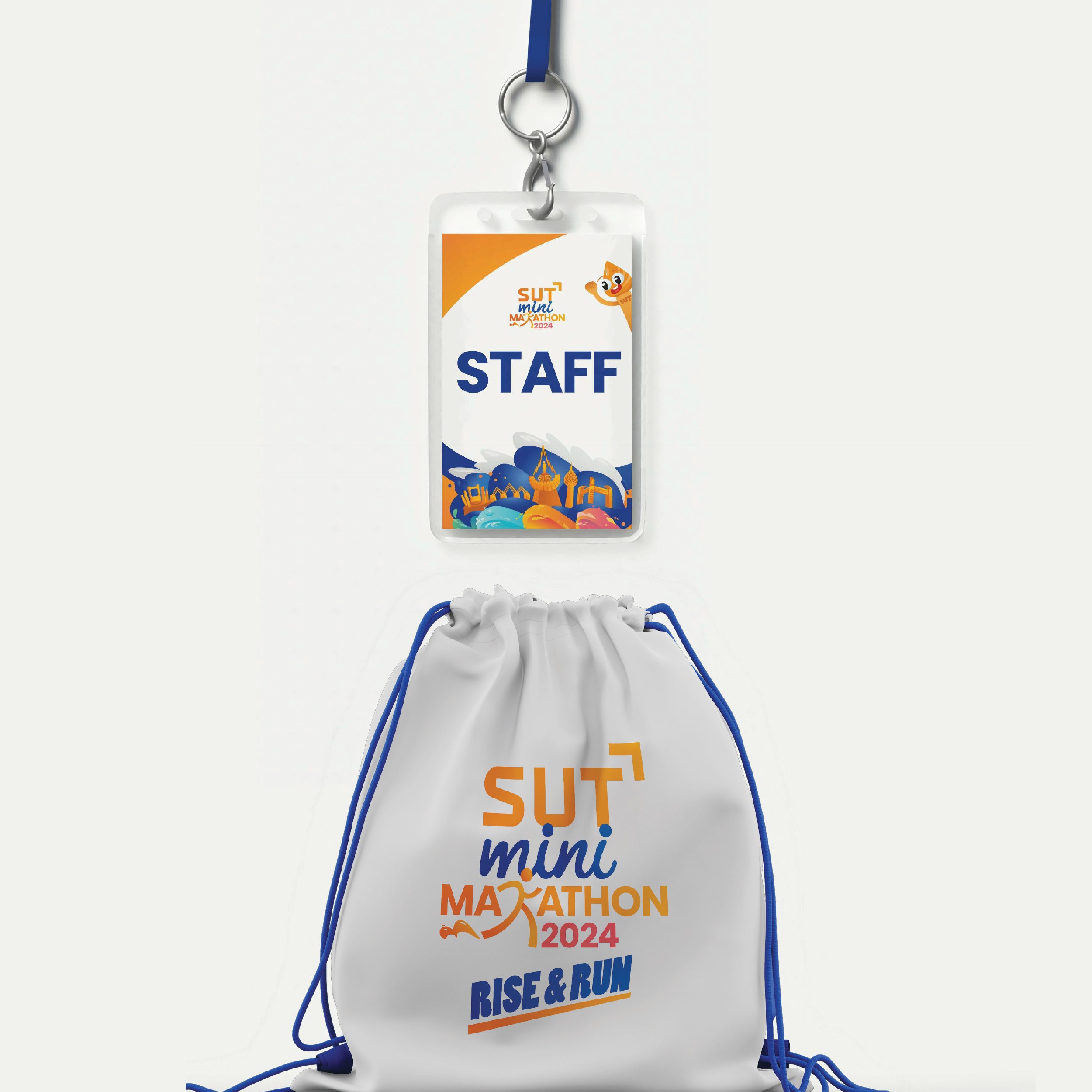
4. From Sketch to Real-life Applications
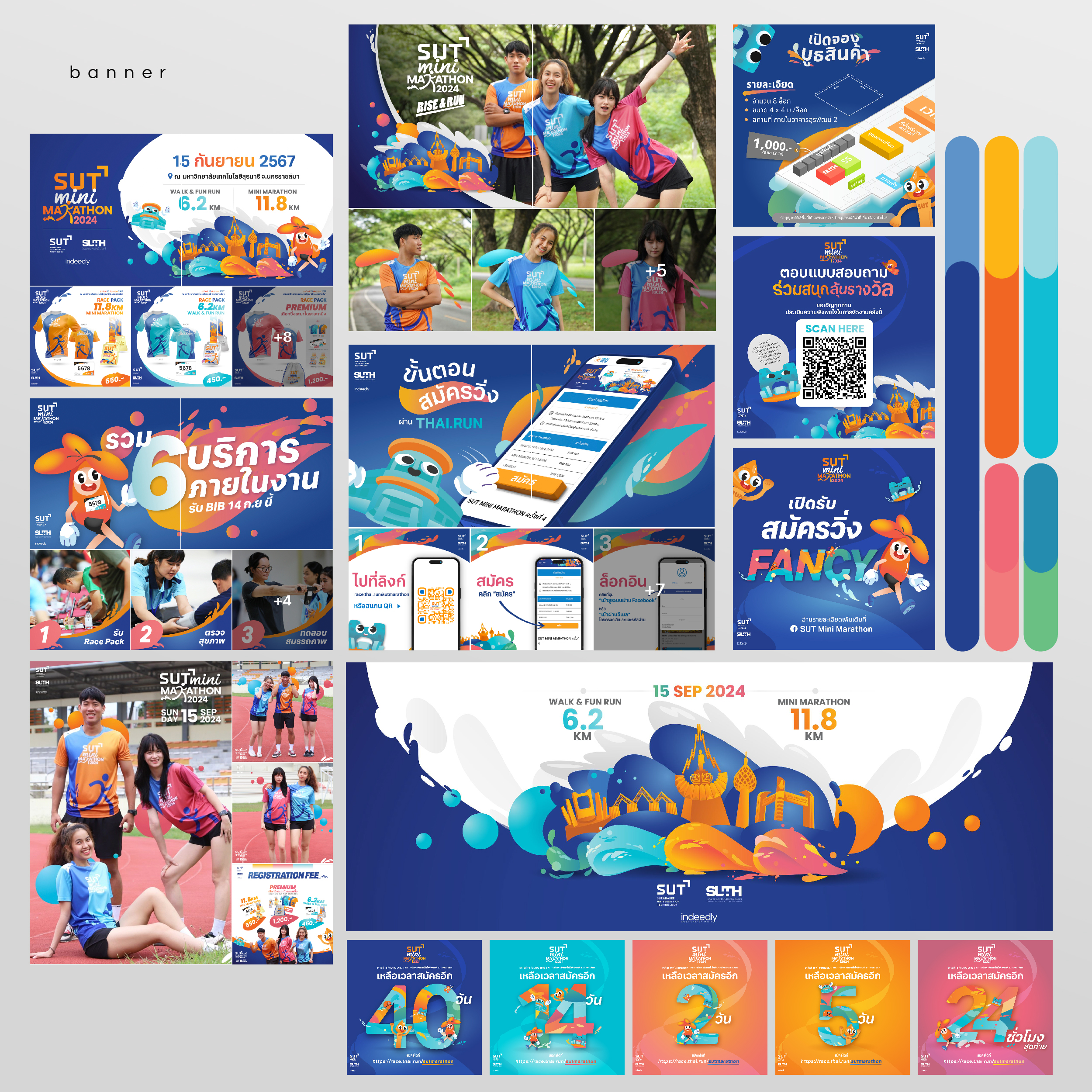
We carefully adapted the identity system to all event touchpoints — maintaining consistency and energy across platforms:
- Social Media: Every banner followed the visual identity strictly — in color, font, and tone.
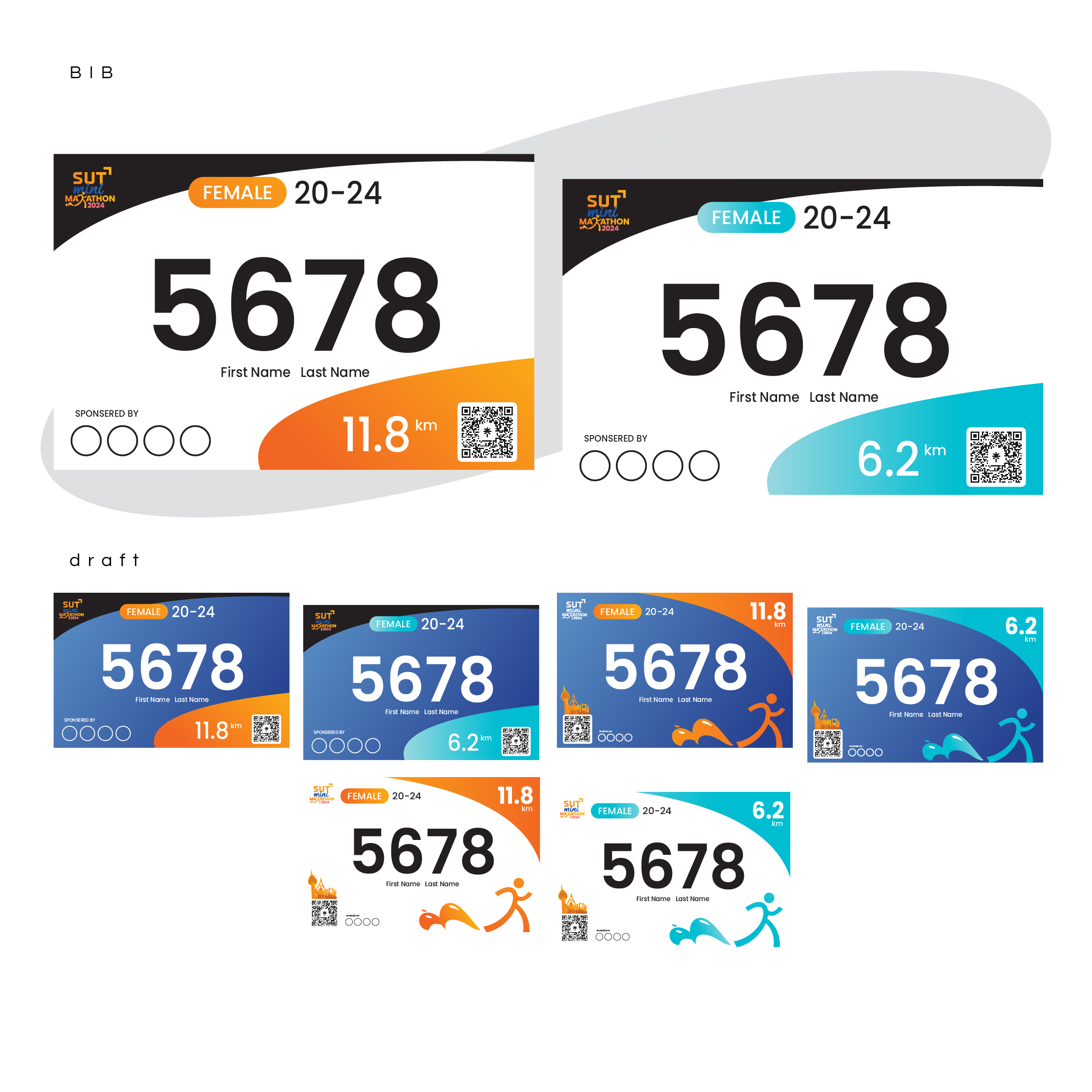
- Race Bibs: We designed three styles for participants to choose from.
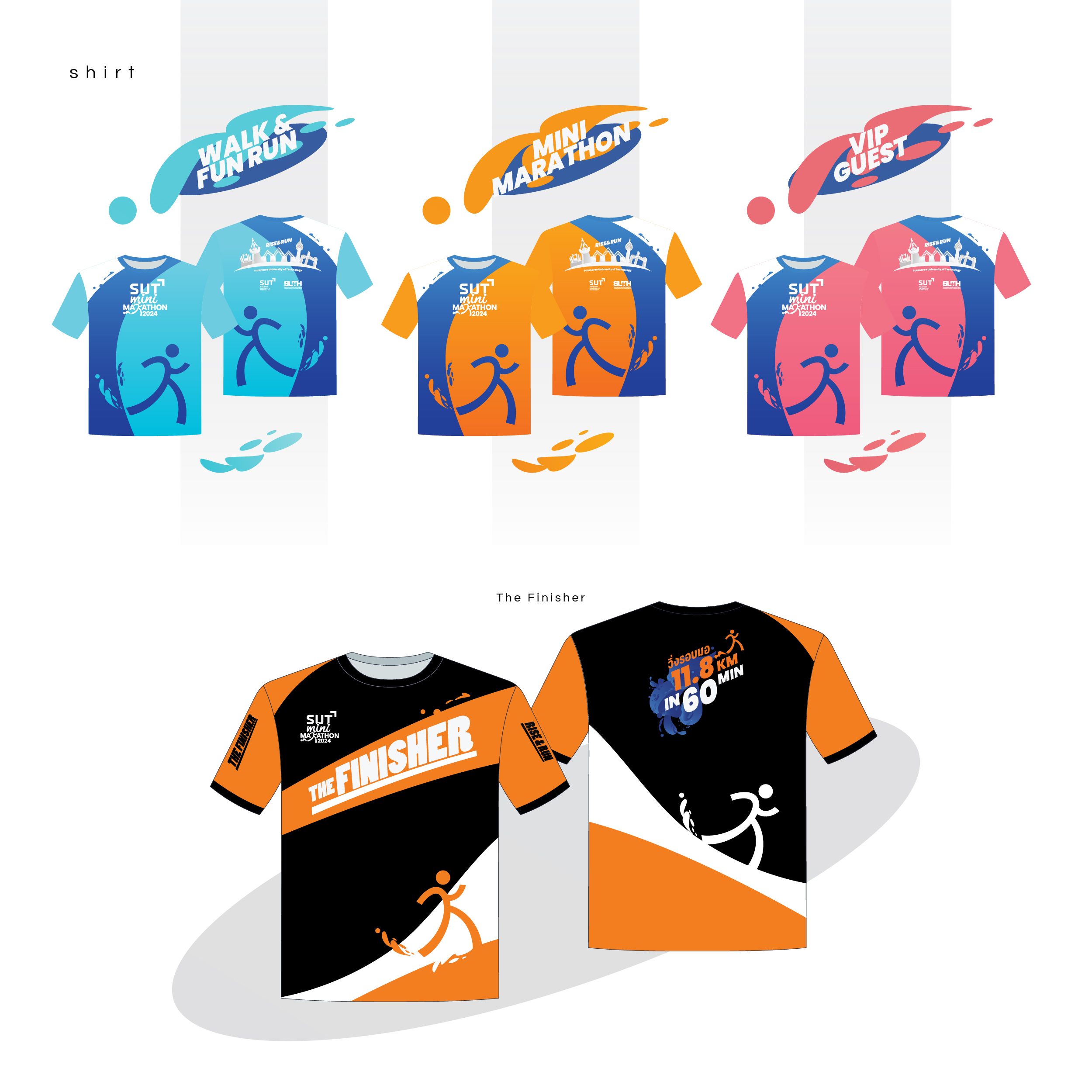
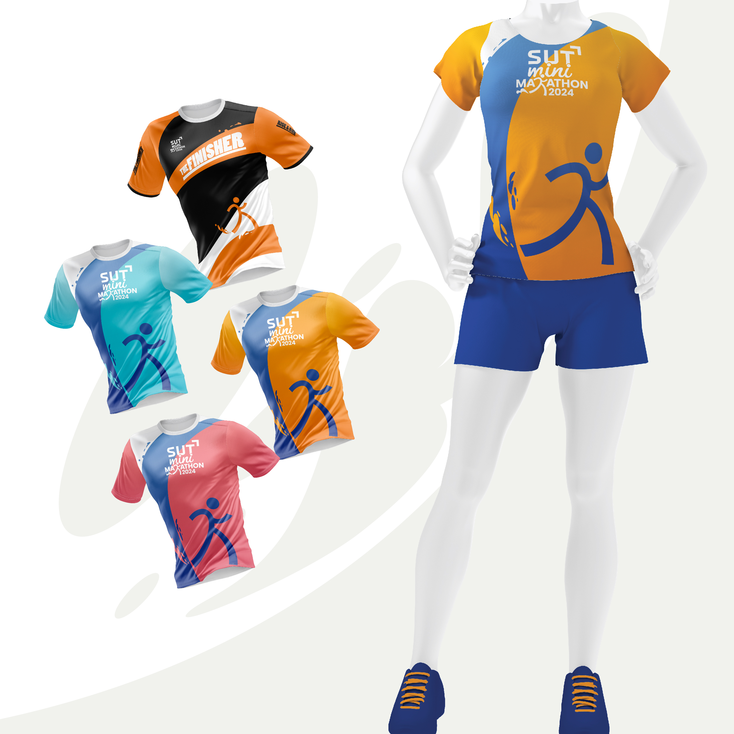
- Event Shirts: Designed using the event’s vibrant color palette — so every photo captured the energy.
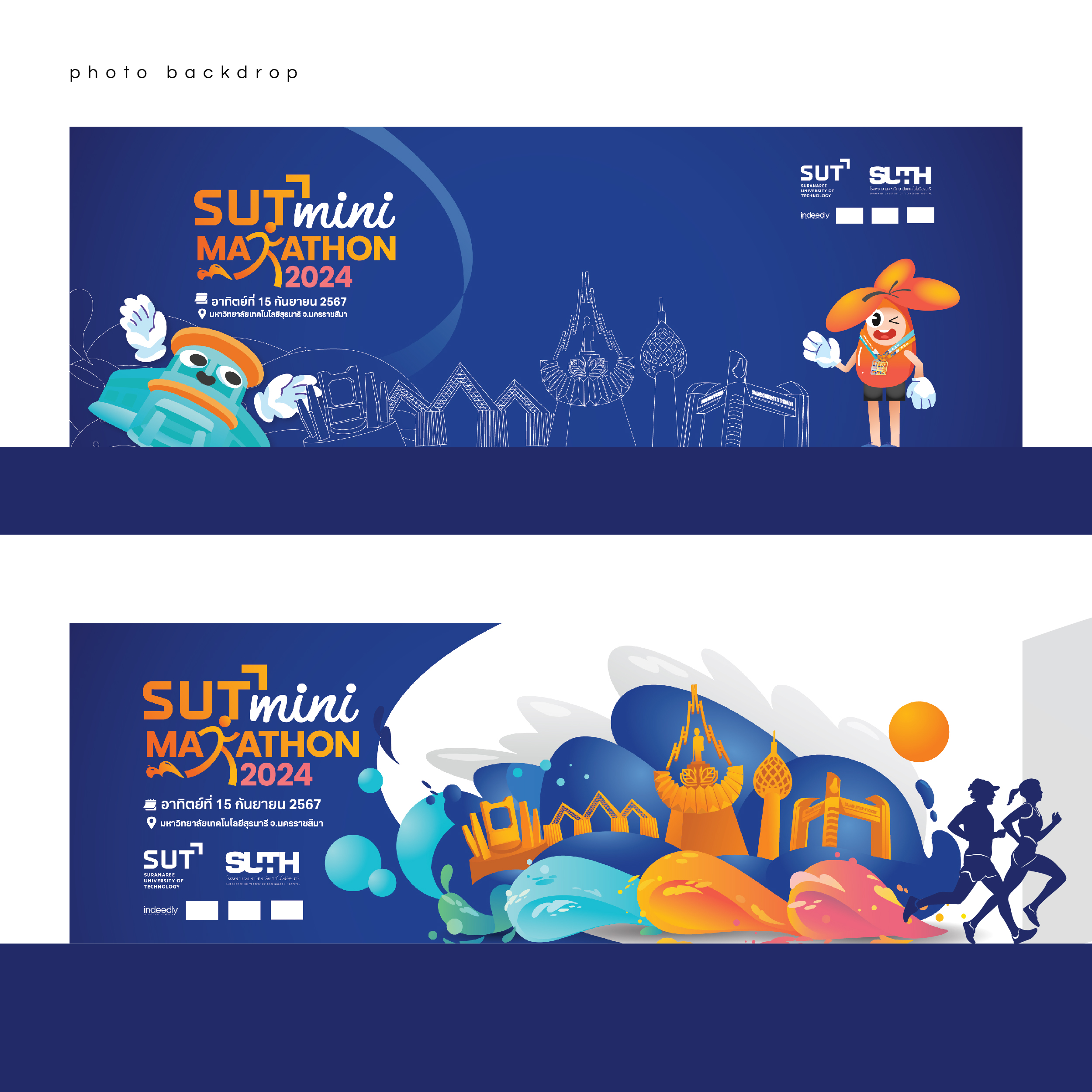
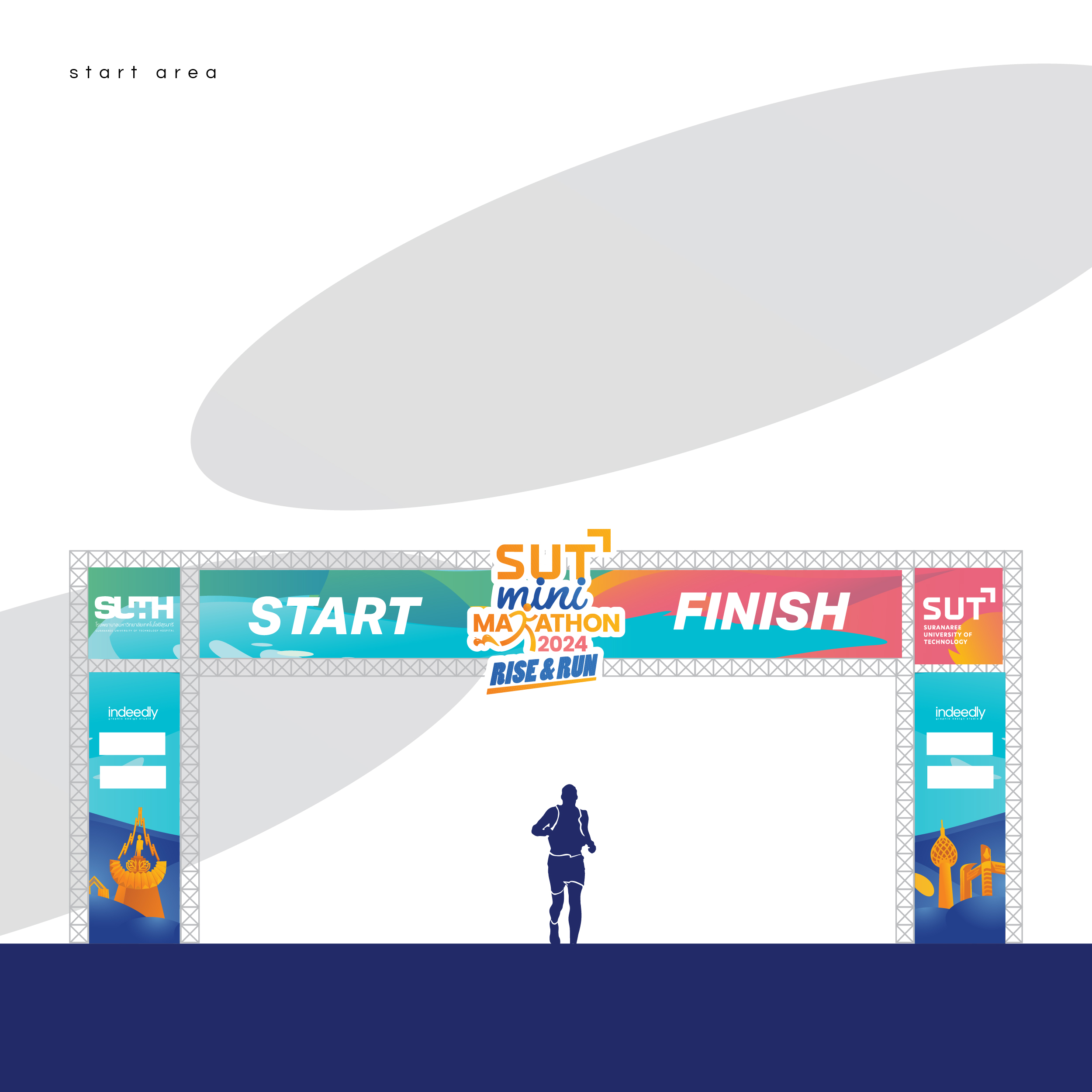
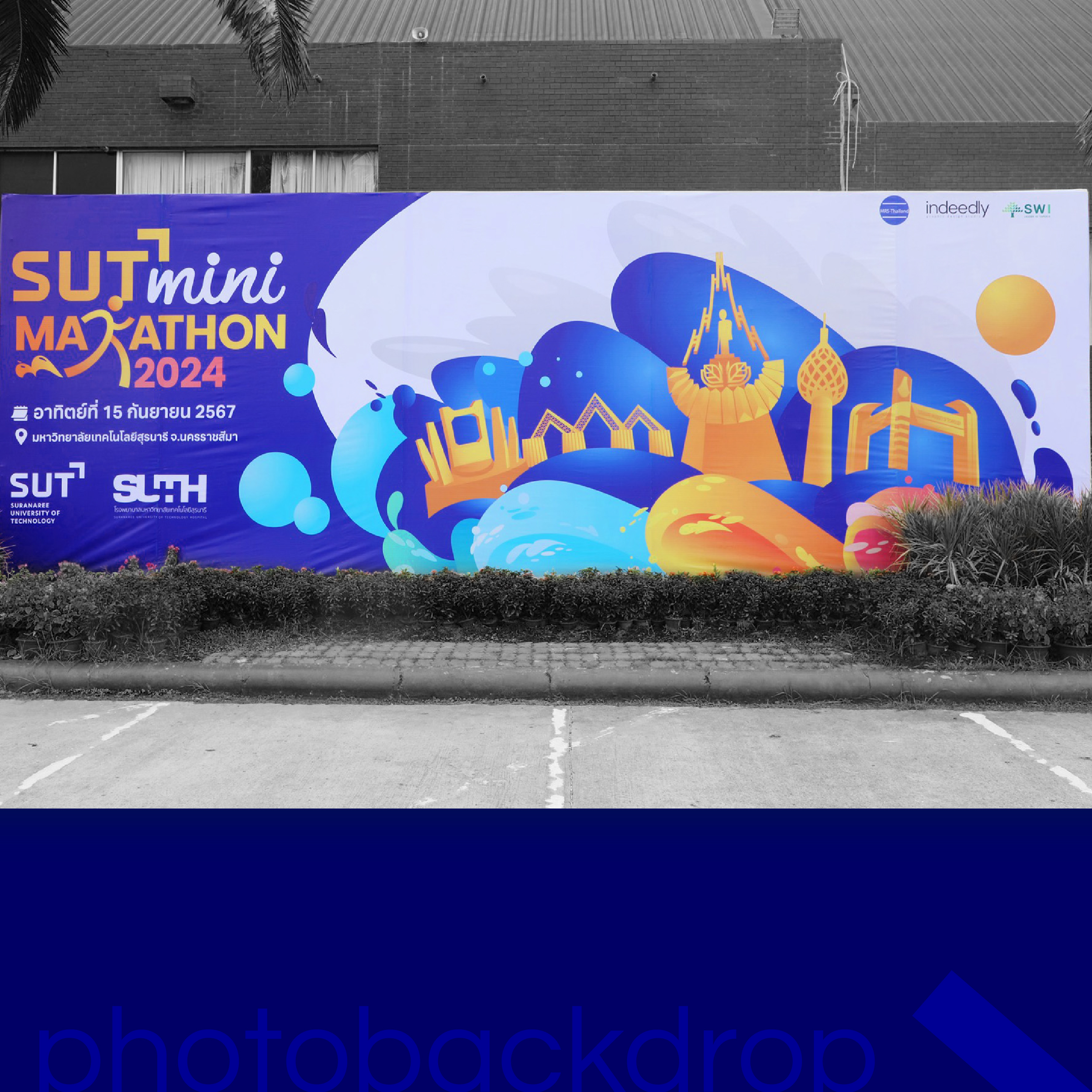
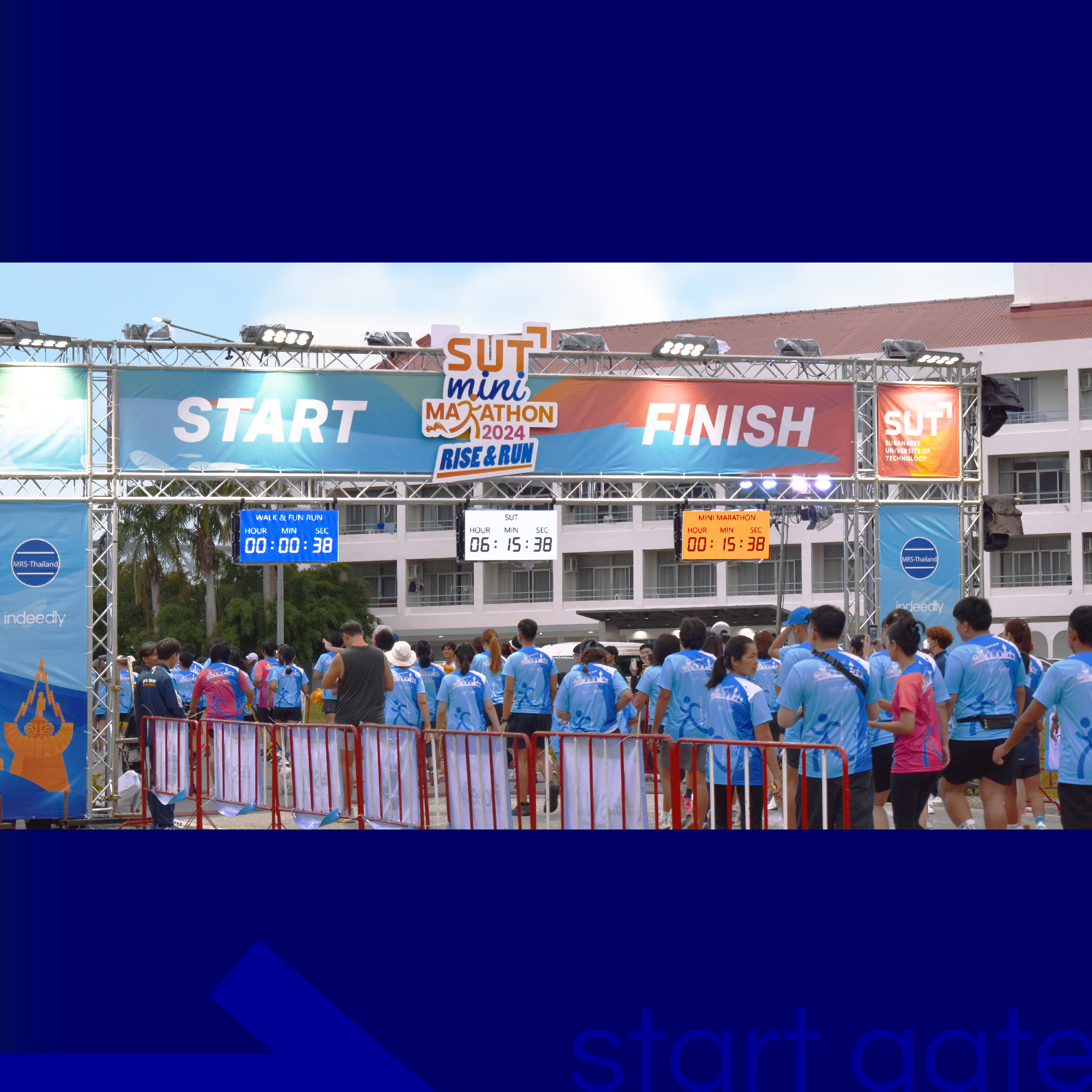
🖤 Finishers received a unique black shirt — the only one “outside” the official theme — creating a sense of exclusivity and making runners feel motivated to complete the 60-minute quest. - Backdrop Designs: Created for both the building front and structural installations like the Start line.
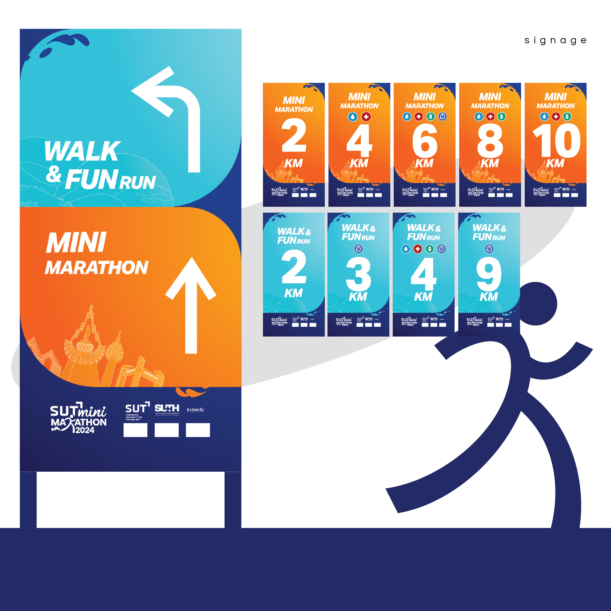
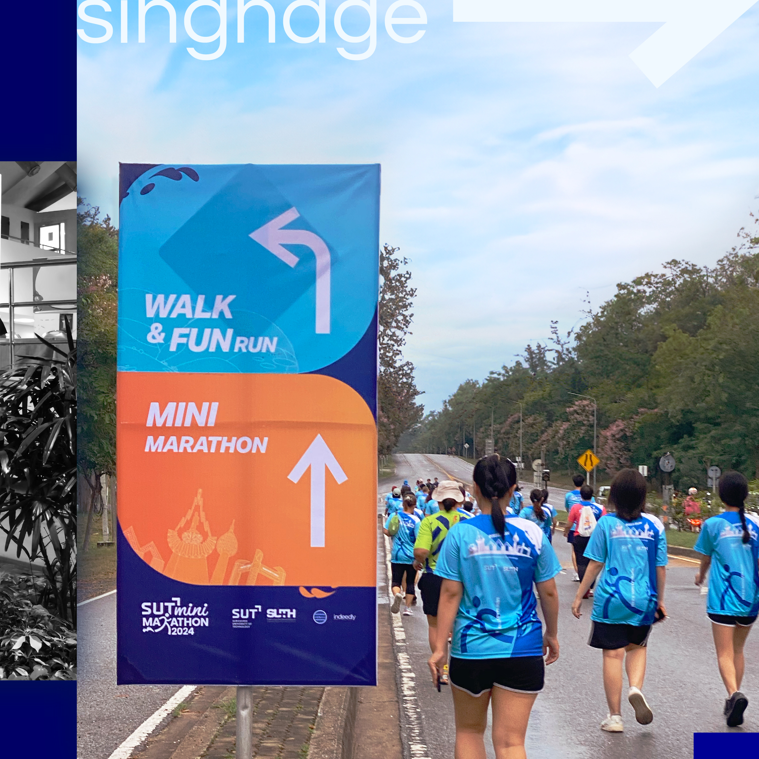
- Signage: Color-coded by category — blue for Fun Run, orange for Mini Marathon — to make the route easy to follow.
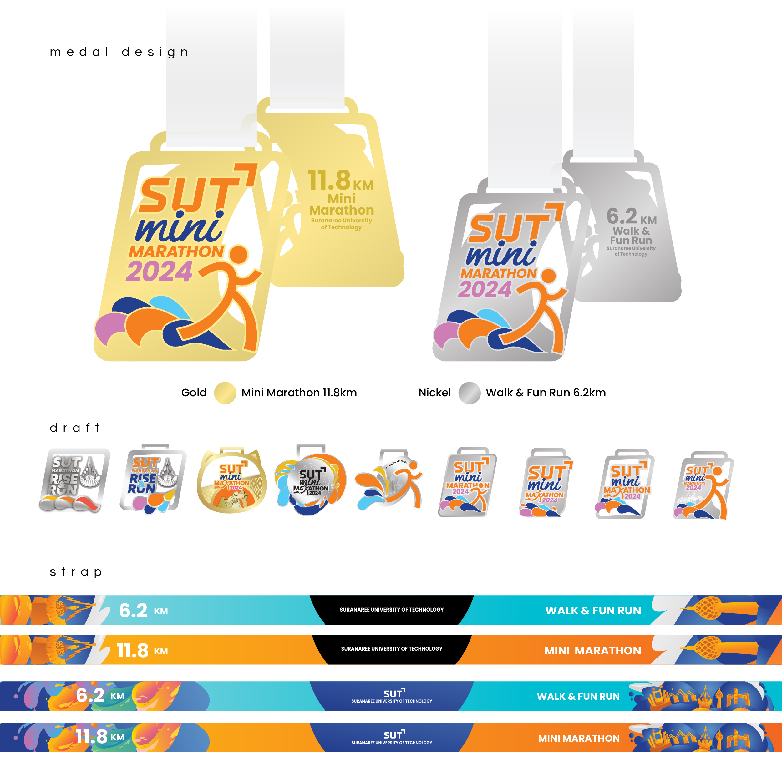
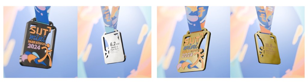
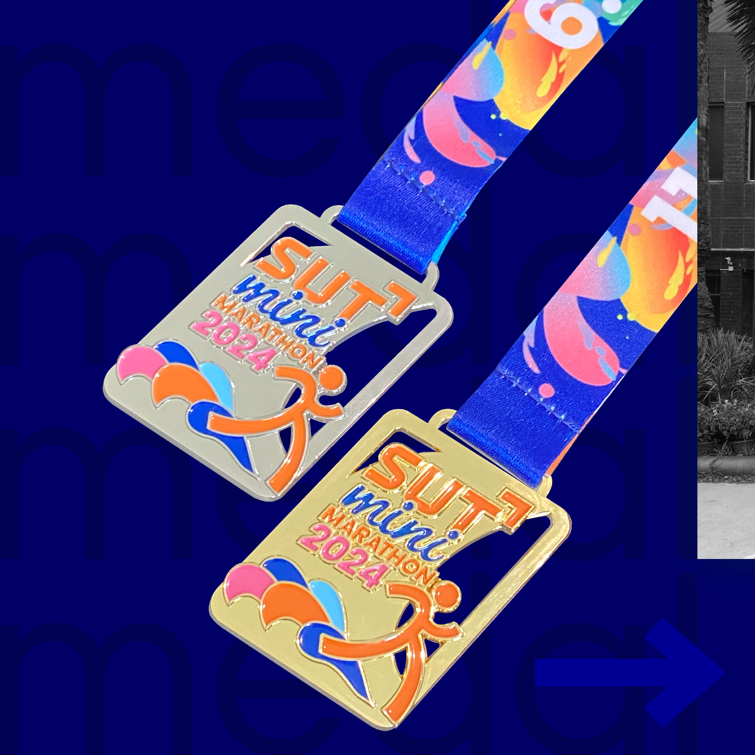
- Finisher Medals: We created multiple design options with 3D render previews to help the client visualize the final look.
⏳ One of the biggest challenges was time — we raced against the clock to finalize medal designs early enough to meet production timelines.
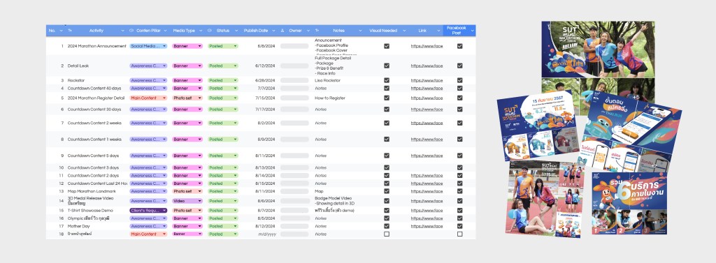
5. Content Planner: Thoughtful, Strategic, and On-brand 🗓
- We planned a content calendar for each topic and rollout phase.
- All artwork was crafted to match the visual identity — vibrant, clean, and bold.
- Every detail was considered — from layout to captions.
- Most importantly, every post was client-approved before publishing.
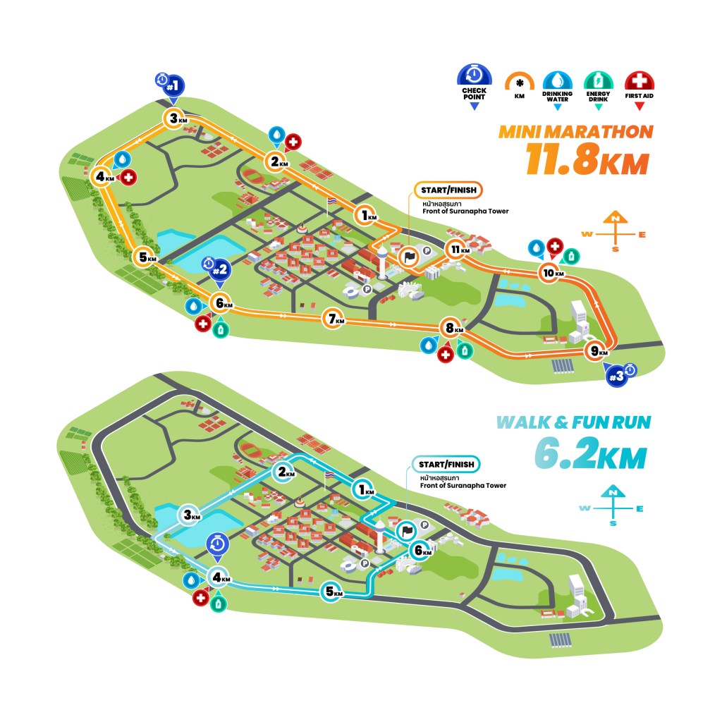
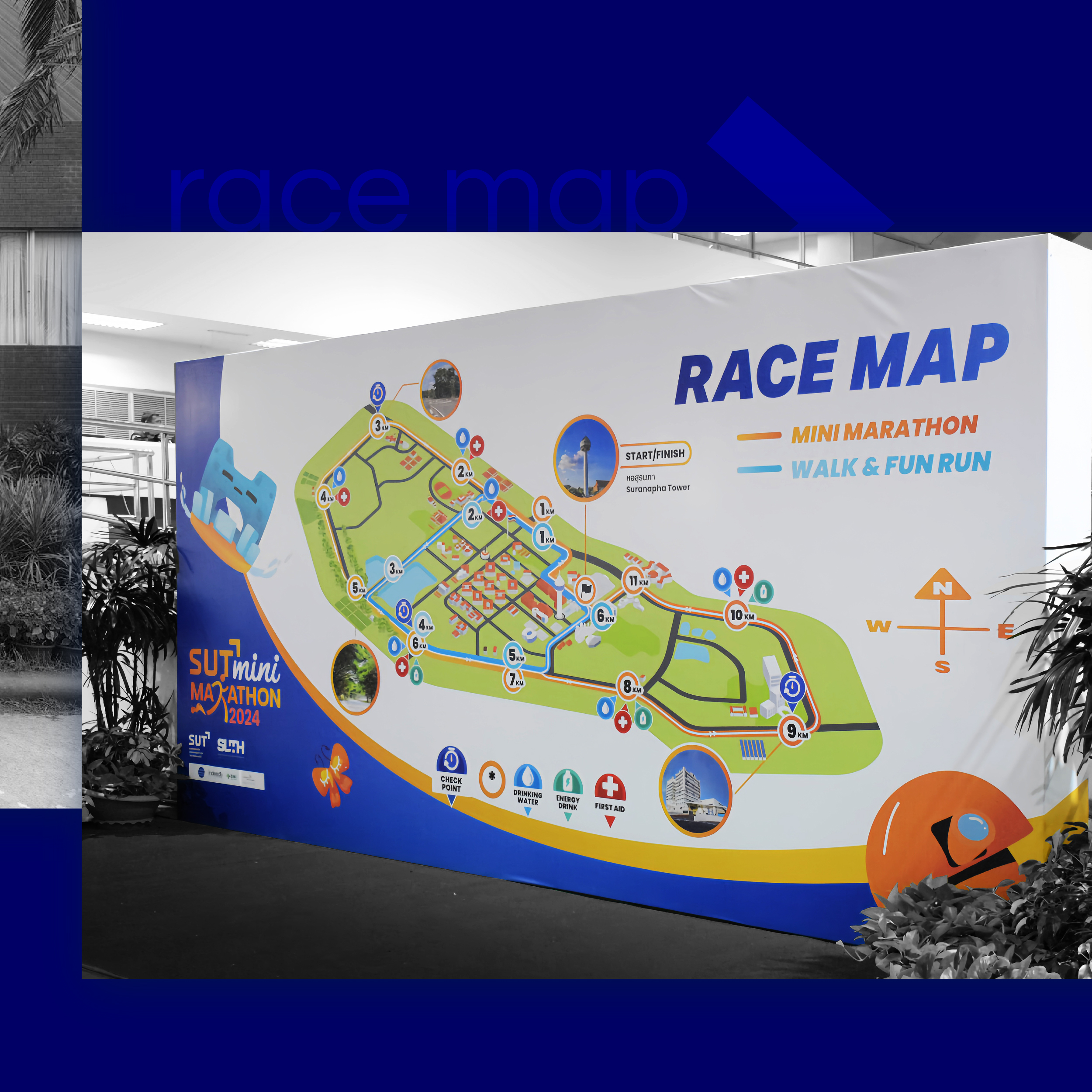
6. The Running Map — in Isometric Style! 🗺
We created an isometric running map, complete with:
- Clear checkpoints
- First aid and water stations
- Differentiated race paths (Fun Run vs Mini Marathon)
One design challenge was showing both race routes clearly in one map without clutter. With smart layering and a lightweight design system, the final artwork came together smoothly and with flow!
This project truly reflects what our team at indeedly set out to achieve — a visual design that captures energy, vibrancy, and movement — the very heart of running itself.
It also echoes the spirit of SUT as a space for growth and creativity, where every design element goes beyond aesthetics. It’s about creating an atmosphere where participants feel welcomed, refreshed, and inspired — surrounded by good vibes woven into every part of the event.
Thank you for reading all the way through! 🙏
If you enjoyed our work, don’t forget to show some love 💙
→ Like our page on Facebook
→ Follow us on Instagram and TikTokLet’s keep creating something meaningful — together ✨
Client: SUT Mini Marathon, Thailand.
© 2024 indeedly studio | details matter to us.
Our team also created a TikTok explaining the full story in detail — Check it out here
